The Buttons block allows you to add buttons linking to other pages on your site or any external page/link. One of the frequent use of this block would be creating a CTA (Call to Action) button for your visitors.
Adding a Buttons Block
To add a Buttons block, click on the Block Inserter icon or “/buttons” slash inserter. After adding a button, you can call it what you would like to say.
Adding a Buttons block
For more, visit our detailed instructions from here.
Block Interface
Every block has a native toolbar of block-specific controls that lets you manipulate the block during insertion.
The parent Buttons block provides the following options with it’s toolbar:
- Parent block selector
- Drag & drop handler to change the block position
- Move up and down
- Change alignment between full and wide width
- Change content justification (more on this below)
Individual Button blocks offers the following options with it’s toolbar:
- Parent Buttons block selector
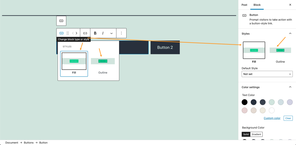
- Change block type or Styles (find more here)
- Drag & drop block handler
- Move left and right
- Insert link/URL
- Bold, Italics, and more text formatting options
Linking a Button
To add a link to your button, click on the Link option that shows in the toolbar. Then paste your link or search the existing pages and posts of your site. You can also press (CTR/CMD+K) shortcut to open Link option.
By default, links will open in the same tab unless you choose the option to set the link to open in a new tab.
Linking a button
Aligning Buttons
You can display the buttons either horizontally (in a row) or vertically (stacked in a column) using the Transform to variation setting on the Buttons block.
To implement any changes, select the parent Buttons selector by clicking on the Buttons symbol. Then you will get the Transform to variation settings on the right side editor-sidebar under the Block section.
You can also choose from the Justify options in the toolbar to align the buttons to the left, right, or center.
Block Settings Panel
Each block has additional options in the editor sidebar, as well as the options found in the block toolbar. If you do not see the sidebar click the ‘gear’ icon next to the Publish button.
Styles
In the Styles options, you can set a Filled color button or Outline style button. You can also change the appearance direct from the popup selector instead of the right side Styles settings.
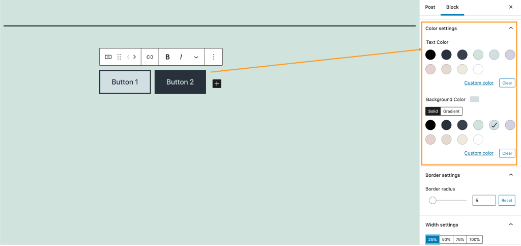
Color Settings
You can chose the Buttons background or text color from the pallet of the Color Settings
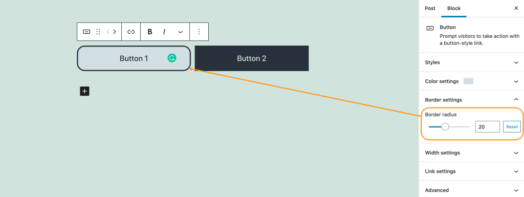
Border settings
The border radius option allows you to give your buttons a rounded appearance. Setting this to 0 means the button has sharp edges.
Width settings
The width settings allow you to define the width of each button in percentage terms.
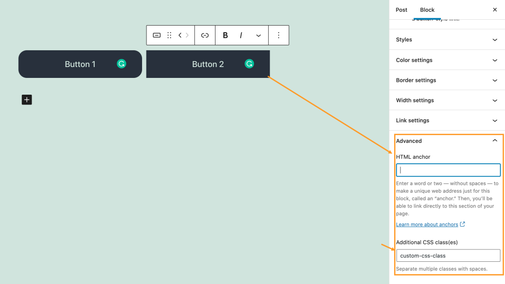
Advanced
The advanced tab lets you add a CSS class to your block, allowing you to write custom CSS and style the block as you see fit.


